
Sunday 06 April 2025
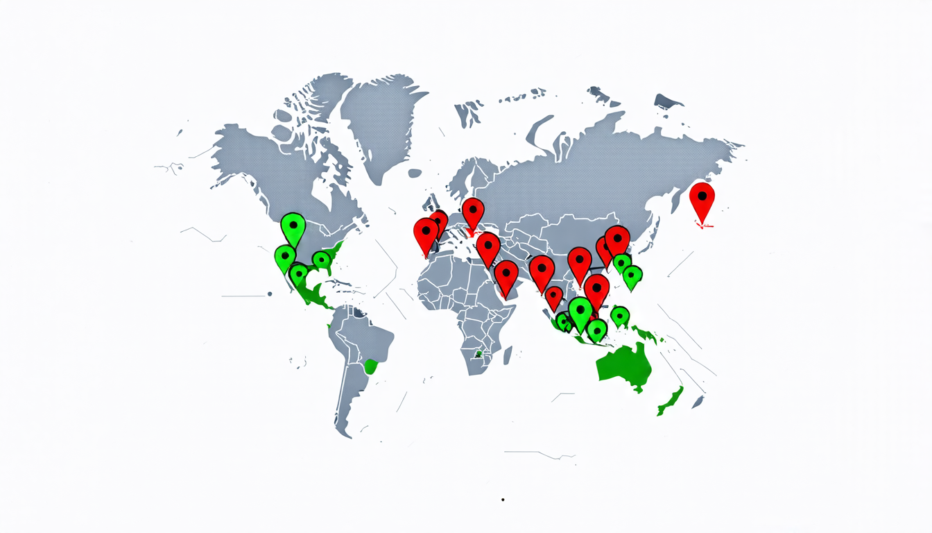
Crisis maps, those visual representations of disasters and emergencies, are a staple in our modern era of instant information. From hurricanes to pandemics, these maps help us make sense of chaotic events and guide our responses. But have you ever stopped to think about how we, as digital natives, interact with these maps? A recent study sheds light on the ways we process and understand crisis maps, revealing some surprising insights.
The researchers behind this study focused on young adults who are digitally native, meaning they’ve grown up with the internet and social media at their fingertips. This generation is particularly interesting because they’re more likely to encounter crisis maps in their daily lives, whether through news outlets or personal social media feeds.
So, how do these digital natives interact with crisis maps? The study found that they tend to engage with maps in distinct ways, which can be categorized into three main activities: inspecting, engaging, and placing. Inspecting involves simply looking at the map to gather information, while engaging means actively interacting with it by clicking on features or zooming in. Placing refers to the process of mentally mapping our own experiences onto the crisis map.
One key finding was that digital natives often struggle with color concepts on crisis maps. You might think that colors like red and green would be universally understood, but surprisingly, some participants had trouble distinguishing between them. This highlights the importance of clear labeling and context for these visual representations.
Another interesting insight is that digital natives tend to respond personally to crisis maps. They may mentally map their own experiences or emotions onto the map, which can influence how they perceive the crisis. For example, someone who has lost a loved one in a natural disaster might feel a strong emotional connection to a map showing the affected area.
The study also uncovered some friction points that can arise when interacting with crisis maps. These include struggles with color concepts, missing context, lack of personal connection, and even distrust. Understanding these barriers is crucial for effective communication during crises.
So what does this mean for crisis mapping in the future? The researchers suggest that designers should prioritize clear labeling, provide more context about the data being presented, and consider incorporating personal stories or experiences to help create a deeper emotional connection with the map. By doing so, they can improve the effectiveness of crisis maps and ultimately support better decision-making during emergencies.
In essence, this study highlights the importance of understanding how digital natives interact with crisis maps.
Cite this article: “Deciphering Digital Natives Crisis Maps: A Study on Sensemaking and Trust in Visualization Design”, The Science Archive, 2025.
Crisis Mapping, Digital Natives, Visual Representations, Disaster Response, Pandemics, Hurricanes, Emergency Management, Information Processing, Color Concepts, Emotional Connection