Friday 02 May 2025
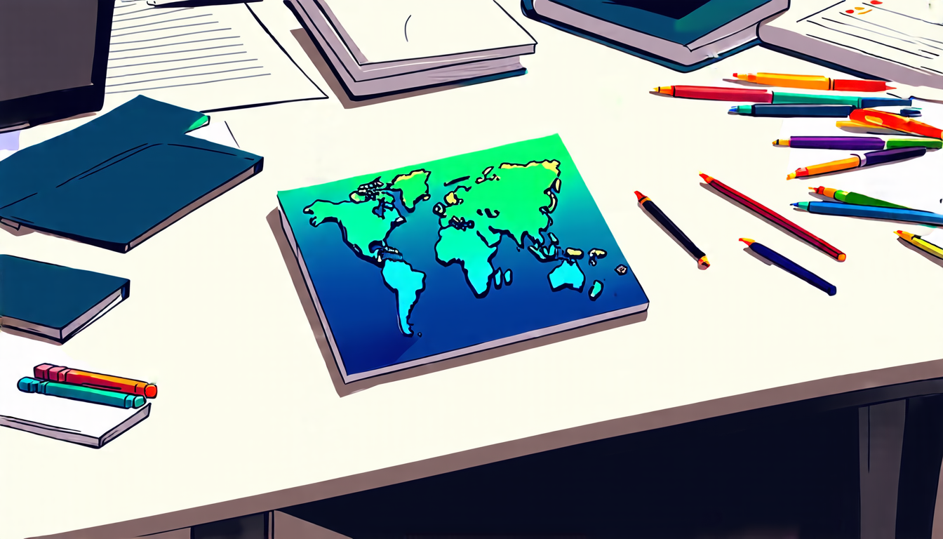
The intricate dance of mapmaking, where cartographers must balance aesthetics and data accuracy to effectively communicate complex information. A new study delves into this process, shedding light on how individual mapmakers make decisions about color schemes, binning methods, and more.
Researchers interviewed 16 experienced cartographers to gain insight into their thought processes during the mapping process. The results are fascinating: each mapmaker’s approach is uniquely influenced by their personal preferences, professional experiences, and organizational norms. For instance, some rely on tried-and-true methods, while others experiment with new techniques to stand out.
One key finding is that cartographers often prioritize ease of use over data accuracy. This might mean choosing a simple color scheme or binning method, even if it compromises the map’s ability to convey nuanced information. This prioritization stems from a desire to make the map accessible and understandable to a broad audience, rather than catering solely to experts.
Another important factor is the impact of organizational norms on cartographic decision-making. Mapmakers working within specific organizations may feel pressure to adhere to established standards or conventions, which can limit their creative freedom. Conversely, those operating independently or in smaller teams may have more latitude to experiment and innovate.
The study also highlights the role of personal preferences in shaping a map’s design. Cartographers’ individual tastes and biases can influence everything from color palette choices to font styles. This is not necessarily a bad thing; after all, human intuition plays a crucial role in many creative endeavors.
One potential consequence of these findings is that cartographic best practices may need to be reevaluated. If individual mapmakers are more likely to prioritize ease of use over data accuracy, we may see more maps that sacrifice nuance for simplicity. On the other hand, if organizations can find ways to support and empower their cartographers, we might see a proliferation of innovative, data-driven visualizations.
Ultimately, this study serves as a reminder of the importance of understanding the human element in mapmaking. By acknowledging and respecting the individual approaches and biases of cartographers, we can create more effective, engaging, and accessible maps that better serve our needs as consumers of information.
Cite this article: “The Cartographers Dilemma: Balancing Aesthetics and Data Accuracy”, The Science Archive, 2025.
Cartography, Mapmaking, Data Accuracy, Aesthetics, Communication, Color Schemes, Binning Methods, Organizational Norms, Personal Preferences, Best Practices