
Wednesday 05 March 2025
The COVID-19 pandemic has been a global crisis, with unprecedented levels of data being generated and analyzed in an effort to understand its spread and impact. One crucial aspect of this efforts is visualization – presenting complex data in a way that’s easy for humans to grasp.
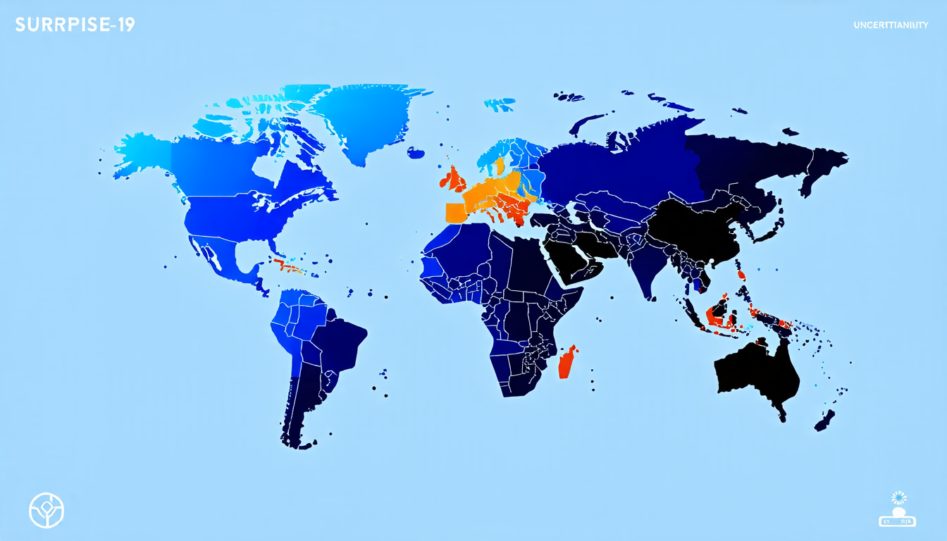
A new study has taken a unique approach to visualizing COVID-19 data by incorporating Bayesian surprise into thematic maps. This method, developed by researchers at Bowling Green State University, aims to provide a more accurate and insightful depiction of the pandemic’s impact.
Traditional thematic maps often rely on raw data, such as case numbers or mortality rates, to create color-coded representations of disease spread. However, these maps can be misleading if they don’t account for factors like base rate bias and sampling error. Bayesian surprise addresses this by calculating the divergence between prior beliefs and observed data, allowing for a more nuanced understanding of the pandemic’s behavior.
The study used a range of public data sources, including the New York Times, Centers for Disease Control and Prevention, and Safegraph, to create an interactive visualization tool. This tool allows users to explore different metrics, such as infection rates and vaccination coverage, across various geographic regions.
One key feature of this approach is its ability to highlight areas where the pandemic’s behavior deviates from expected patterns. By using color gradients to represent surprise values, the maps draw attention to regions that require closer examination or targeted interventions.
The results of this study are promising, with users reporting improved comprehension and engagement with the data. This has significant implications for public health decision-making, as accurate and timely information is critical in responding to the pandemic.
This research also highlights the importance of interdisciplinary collaboration in addressing complex global challenges like COVID-19. By combining expertise from computer science, statistics, and epidemiology, researchers can develop innovative solutions that drive progress in this field.
As the world continues to navigate the ongoing pandemic, the development of effective visualization tools will remain essential. This study’s novel approach to Bayesian surprise-based thematic maps offers a valuable contribution to this effort, providing a more accurate and insightful means of understanding COVID-19’s impact on global health.
Cite this article: “Visualizing COVID-19: A Novel Approach to Thematic Maps Using Bayesian Surprise”, The Science Archive, 2025.
Covid-19, Pandemic, Visualization, Bayesian Surprise, Thematic Maps, Data Analysis, Public Health, Epidemiology, Computer Science, Statistics